EIA Data Analysis
US primary energy consumption by source (Jul 2021-April 2022)
U.S. Electricity is generated from the below primary sources with natural gas accounting for about ~32% of the total share, followed by coal, nuclear and other renewable sources in the winter season.
US natural gas consumption by sector (Jan 2014-Nov 2022)
Residential and commercial sectors have a seasonal peak in winter season due to higher demand for heating where natural gas is directly used in furnaces, heat pumps, radiators and other electric equipments. Industrial sector has a small peak in winter season reflecting some heating related industrial applications. Electric Power sector has two seasonal peaks due to weather fluctuations Winter peak due to more demand for heating. Summer peak due to more demand for air conditioning.
US natural gas consumption Forecast by sector (Jan 2014-Nov 2022)
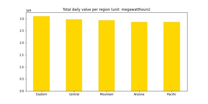
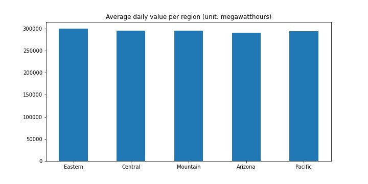
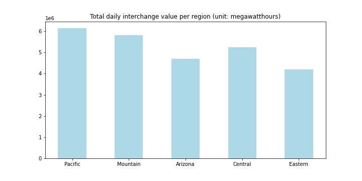
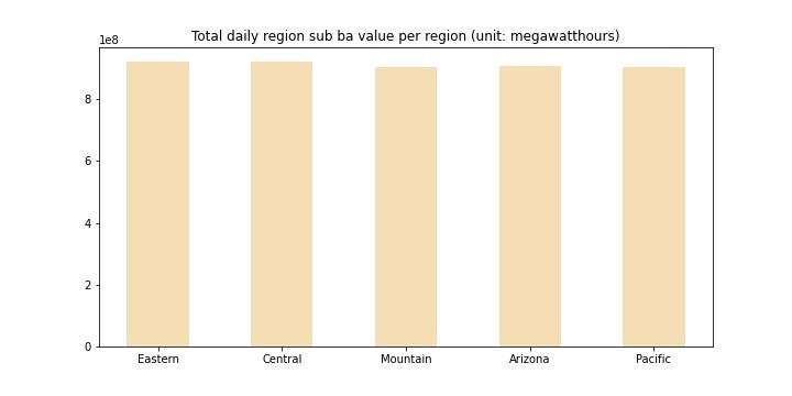
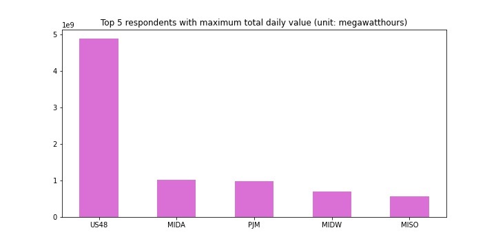
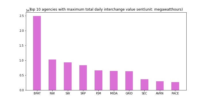
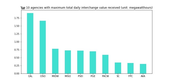
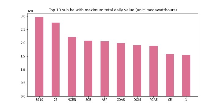
RTO Demand Forecast
Ash content% of fuel sources across states
Texas has the highest overall ash content% Alaska has the highest per thousands of megawatt hours of electric power generation ash content% South Dakota has the highest per capita ash content%
Heat content% of fuel sources across states
Tennessee has the highest overall heat content% Alaska has the highest per thousands of megawatt hours of electric power generation heat content% South Dakota has the highest per capita heat content%
Sulfur content% of fuel sources across states
Indiana has the highest overall sulfur content% South Dakota has the highest per thousands of megawatt hours of electric power generation sulfur content% South Dakota has the highest per capita sulfur content%
State Electricity Profiles
The following datasets have been analysed here:
- state-electricity-profiles-emissions-by-state-by-fuel
- state-electricity-profiles-source-disposition
- state-electricity-profiles-capability
- state-electricity-profiles-source-disposition
- state-electricity-profiles-summary
SO2 Emissions
The main factors behind SO2 emissions are - combustion of fossil fuels and industrial processes. There is a significant gap in the emissions produced in the West and the East. States like Ohio, Indiana, West Virginia, Kentucky and Wisconsin have consistently been producing more and more emissions with exponentially increasing rates due to presence of power plants and industrial boilers. The rates at which these emissions are produced are increasing, which indicates that the technologies/processes being used are not efficient and environment friendly with respect to SO2 emissions. States like California, Washington and Oregon have been much ‘greener’ as the population in these states has risen significantly, yet, their SO2 emissions have been in constant control.
CO2 Emissions
Again the CO2 emissions rates are higher in central USA. Although the ascent in the CO2 emission rates in many states have been controlled to an extent. For example, Washington and Oregon have actually managed to reduce these rates over 30 years. Wyoming has been consistently among the top when it comes to CO2 emissions.The reason Wyoming marks so high in federal emissions is that the state produces roughly 40% of the thermal coal in the country, which is shipped to power plants through the West and Midwest and burned for electricity.
NOx Emissions
NOX Emissions are mainly caused by industrial sources such as power plants, industrial boilers, cement kilns, and turbines. These rates have been much higher in mostly the central USA. The important thing to notice is that these rates have been kept on check in contrast the SO2 emission rates. Again the western part of USA has lower emission rates than the eastern and the central part. Alaska has been much worse than the rest of USA. Since 1997, Alaska's economy demonstrated continuous growth and its population has increased. NOTE: These figures only indicate the emissions through electricity power generation.
Green Score
This score is a value between 0 (Poor) and 5 (Best) and measures the environmental impact of electricity generation. Green score takes into consideration the primary contributors to global warming [NOx and CO2]. This score scales NOx to CO2 equivalent and normalises the value to per unit of electricity generation.
Inference
The Green Score has been improving over the years, meaning decision makers are pushing more towards greener sources of energy. This essentially could be due to improved power generation techniques.
SO2 Score
This score is a value between 0 (Best) and 5 (Poor) and measures the amount of SO2 emission during electricity generation. This again is normalised per unit of electricity generation.
Inference
The SO2 score has been getting better over the years. This could be due to using fuel sources with lower Sulphur content.
Independent Power Producer Ratio
Inference
The share of private power producers has been increasing over the years and is now almost 40% of the total electricity production in the US.
Capability Plot
Inference
This plot shows the electricity generated from some of the major sources such as Coal, Natural Gas, Wind, etc. The amount of coal used in electricity generation has been steadily decreasing since 2010. Natural Gas has been increasing and so are renewable sources such as wind, solar, etc. This is probably one of the reasons why the green score and SO2 scores have been improving over the years.
Net Generation
Inference
The plot shows the total retail sales in various states over the years. This value has been increasing over the years
Total Retail Sales
Inference
The plot shows the net generation in various states over the years. This value has been increasing over the years
Self Sufficiency Index
Inference
This plot shows the self sufficiency index which is a measure of energy independence of each state. A self sufficiency index of around 1 indicates that a state consumes what it produces and could be self sufficient. Many states fall under this category.
RTO Data Analysis